Caveman@piefed.social to 196@lemmy.blahaj.zoneEnglish · 1 month agoHeight Chartmedia.piefed.socialimagemessage-square44linkfedilinkarrow-up1376arrow-down114
arrow-up1362arrow-down1imageHeight Chartmedia.piefed.socialCaveman@piefed.social to 196@lemmy.blahaj.zoneEnglish · 1 month agomessage-square44linkfedilink
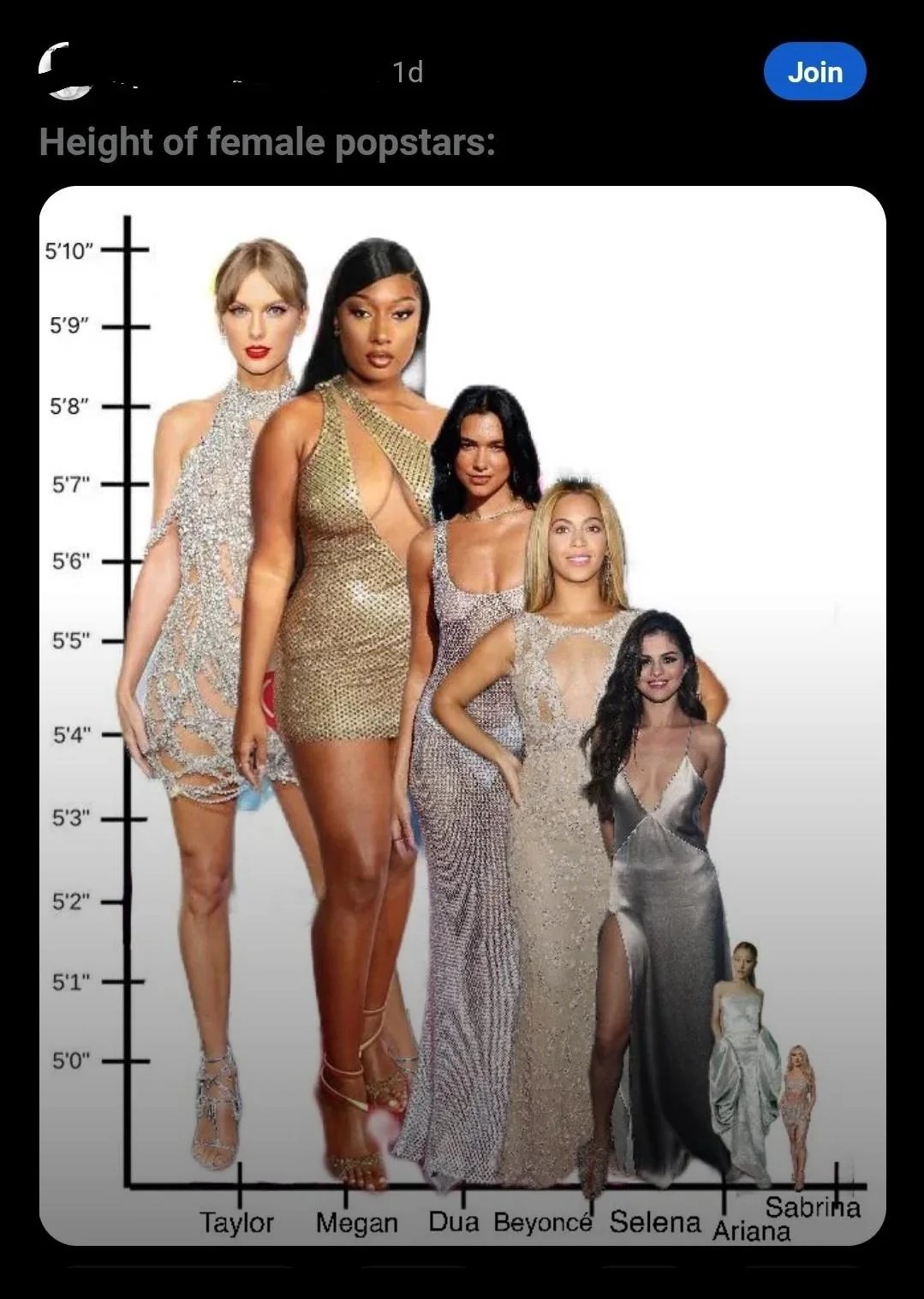
minus-squaretaiyang@lemmy.worldlinkfedilinkEnglisharrow-up21·1 month agoHeights are potentially a good example of that. Iirc, the standard deviation of height is only about 3 inches (for women), so doing the full y-axis would make small differences between groups impossible to visually compare.
minus-squareChaoticNeutralCzech@feddit.orglinkfedilinkEnglisharrow-up11·1 month agoHow about a chart starting at 0, then cropping the bottom ¾ − not showing the full body but with heads in proportion?
minus-squareLog in | Sign up@lemmy.worldlinkfedilinkEnglisharrow-up3·1 month agoIf these women have such similar heights, what on earth is the point in showing the differences between them so misleadingly starkly?

Heights are potentially a good example of that. Iirc, the standard deviation of height is only about 3 inches (for women), so doing the full y-axis would make small differences between groups impossible to visually compare.
How about a chart starting at 0, then cropping the bottom ¾ − not showing the full body but with heads in proportion?
If these women have such similar heights, what on earth is the point in showing the differences between them so misleadingly starkly?